Dual Branding for Coaching and Event Agency
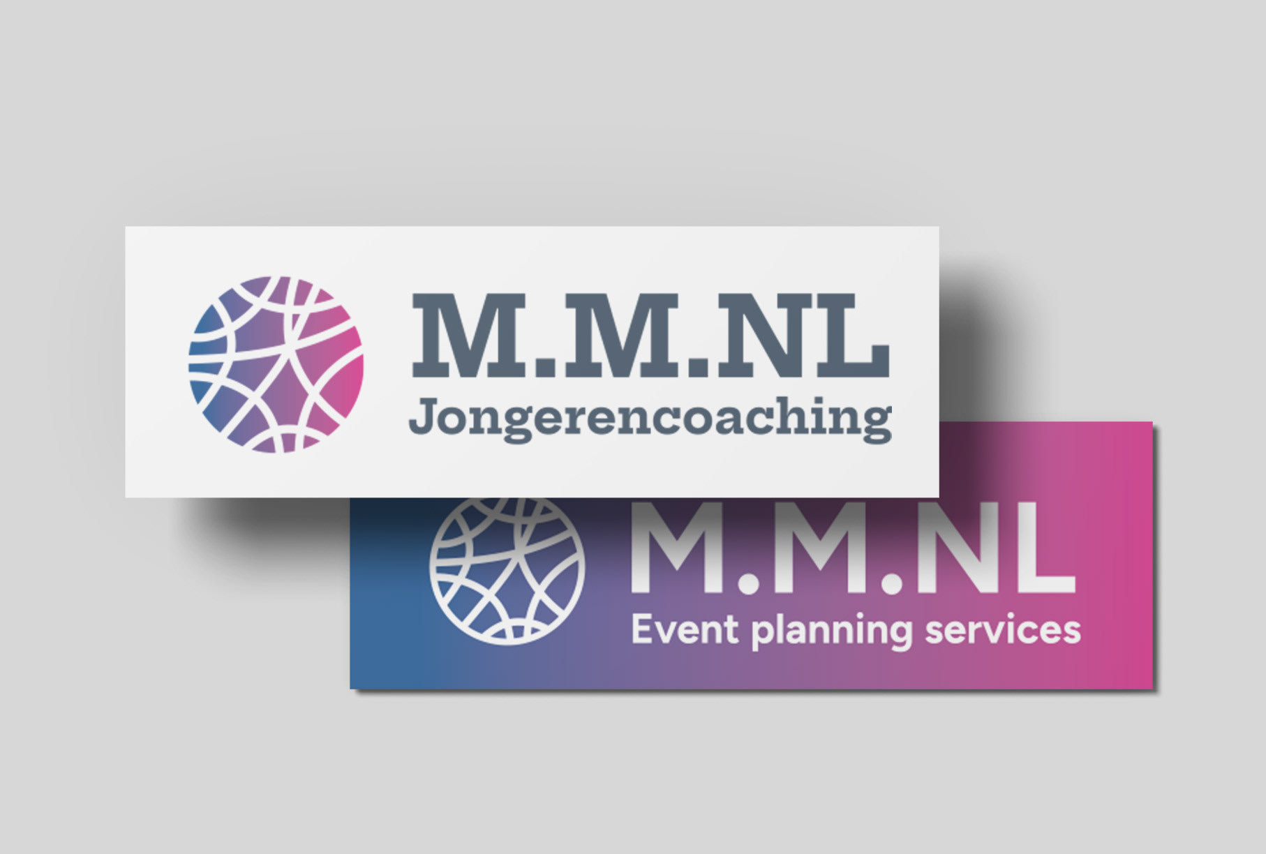
For this project, I worked with a client who runs two distinct businesses: a youth coaching practice and an event agency. The challenge was to create two logos that were visually connected but still distinct, reflecting the unique essence of each business while highlighting the client as the common thread.
For this project, I worked with a client who runs two distinct businesses: a youth coaching practice and an event agency. The challenge was to create two logos that were visually connected but still distinct, reflecting the unique essence of each business while highlighting the client as the common thread.
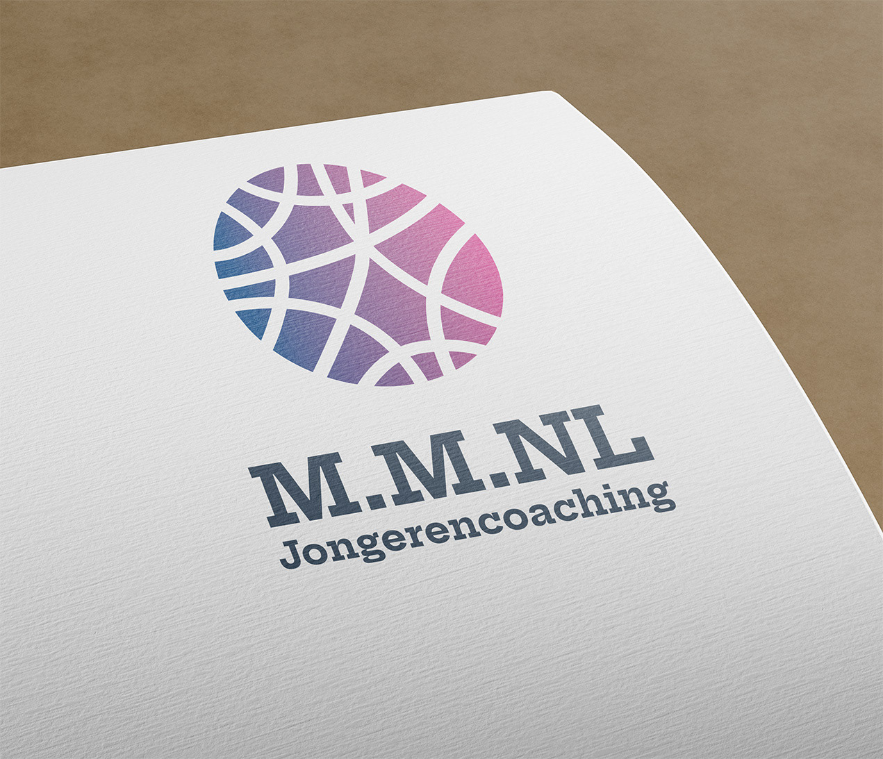
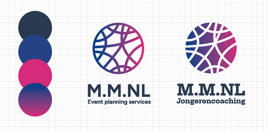
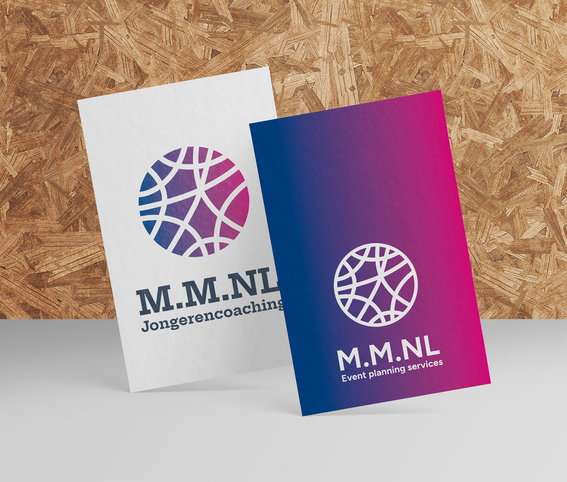
For the youth coaching logo, I designed a concept that symbolizes clarity and guidance. The design features dynamic lines that represent the tangled thoughts and emotions young people often experience. As they work with the client to find their path, these lines gradually take on color, symbolizing clarity, growth, and direction.
For the event agency logo, I reversed the concept. Here, the event starts with structure and focus but gains vibrancy and life through the client’s work. The addition of color represents the energy, creativity, and success that her expertise brings to every event she organizes.
Together, these logos not only form a cohesive visual identity but also come together as one complete, rounded design, symbolizing the harmony and connection between the two businesses.