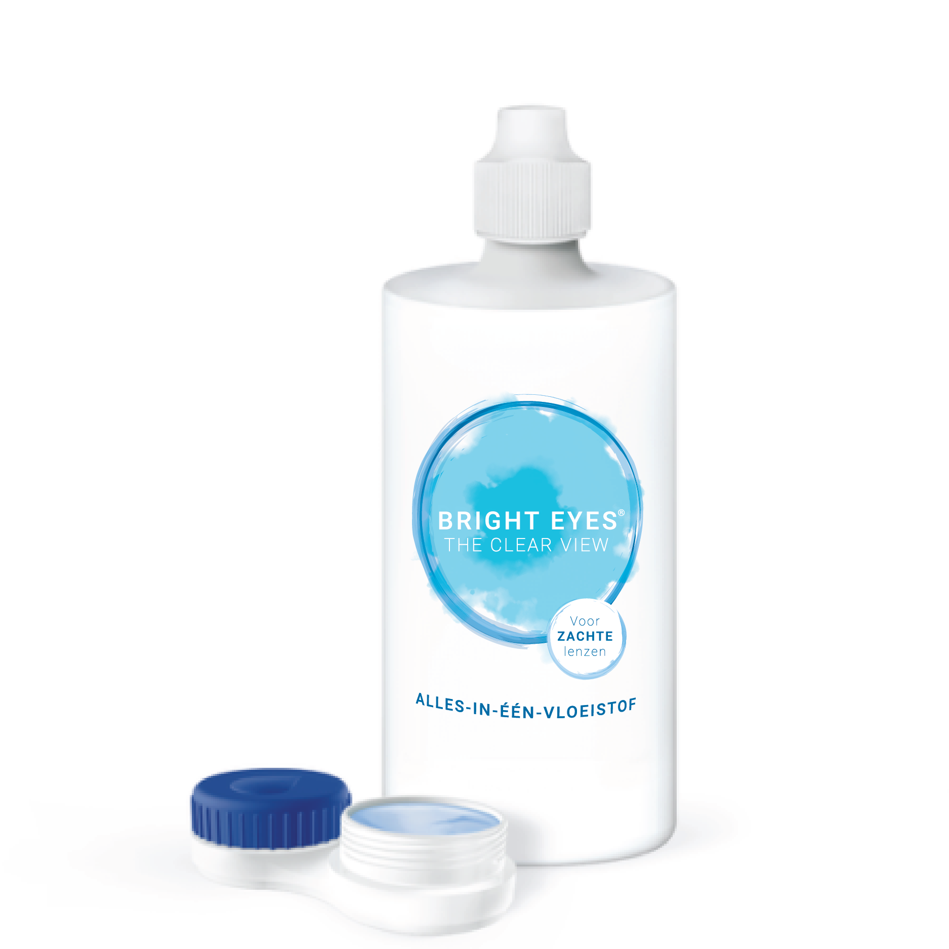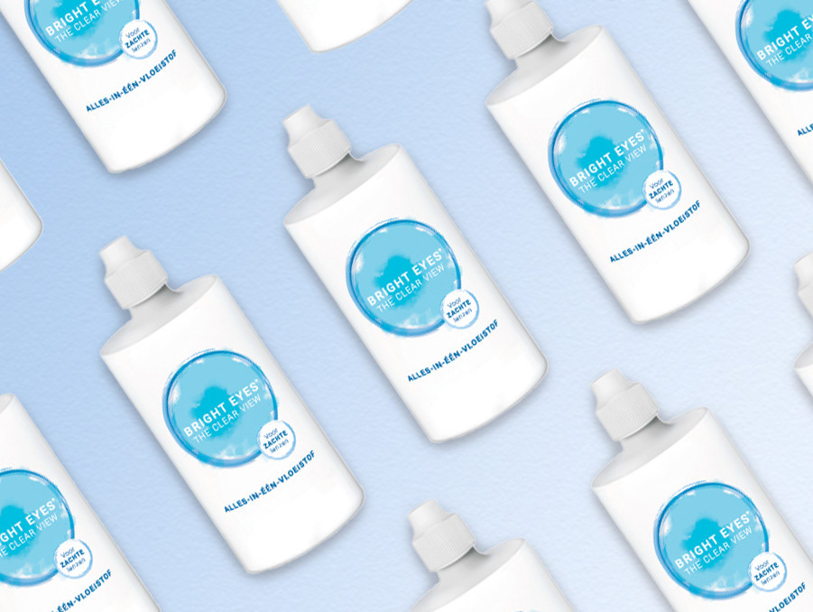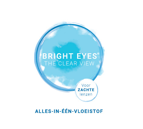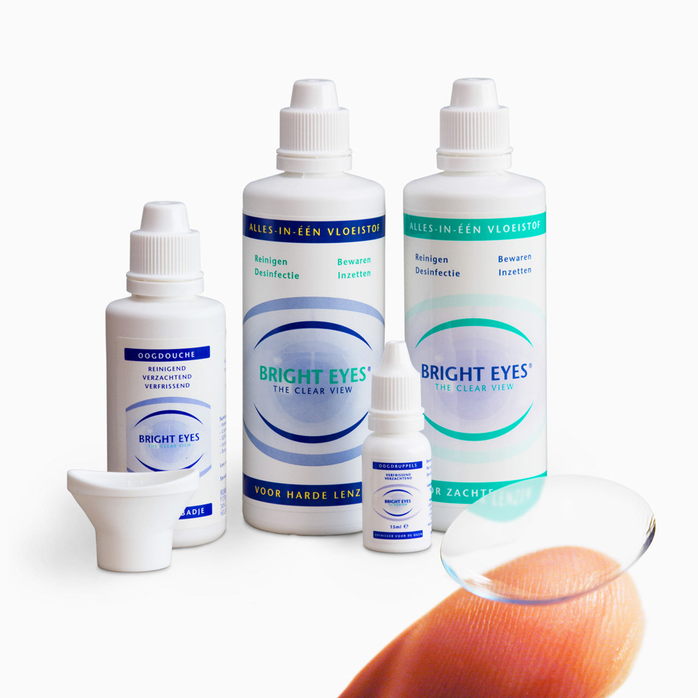
A Fresh Look for Bright Eyes
Bright Eyes, a trusted name in lens care, needed a packaging update to replace their outdated design. I was tasked with reimagining their visual identity, creating a look that felt fresh, modern, and reflective of the product’s essence.
Bright Eyes, a trusted name in lens care, needed a packaging update to replace their outdated design. I was tasked with reimagining their visual identity, creating a look that felt fresh, modern, and reflective of the product’s essence.
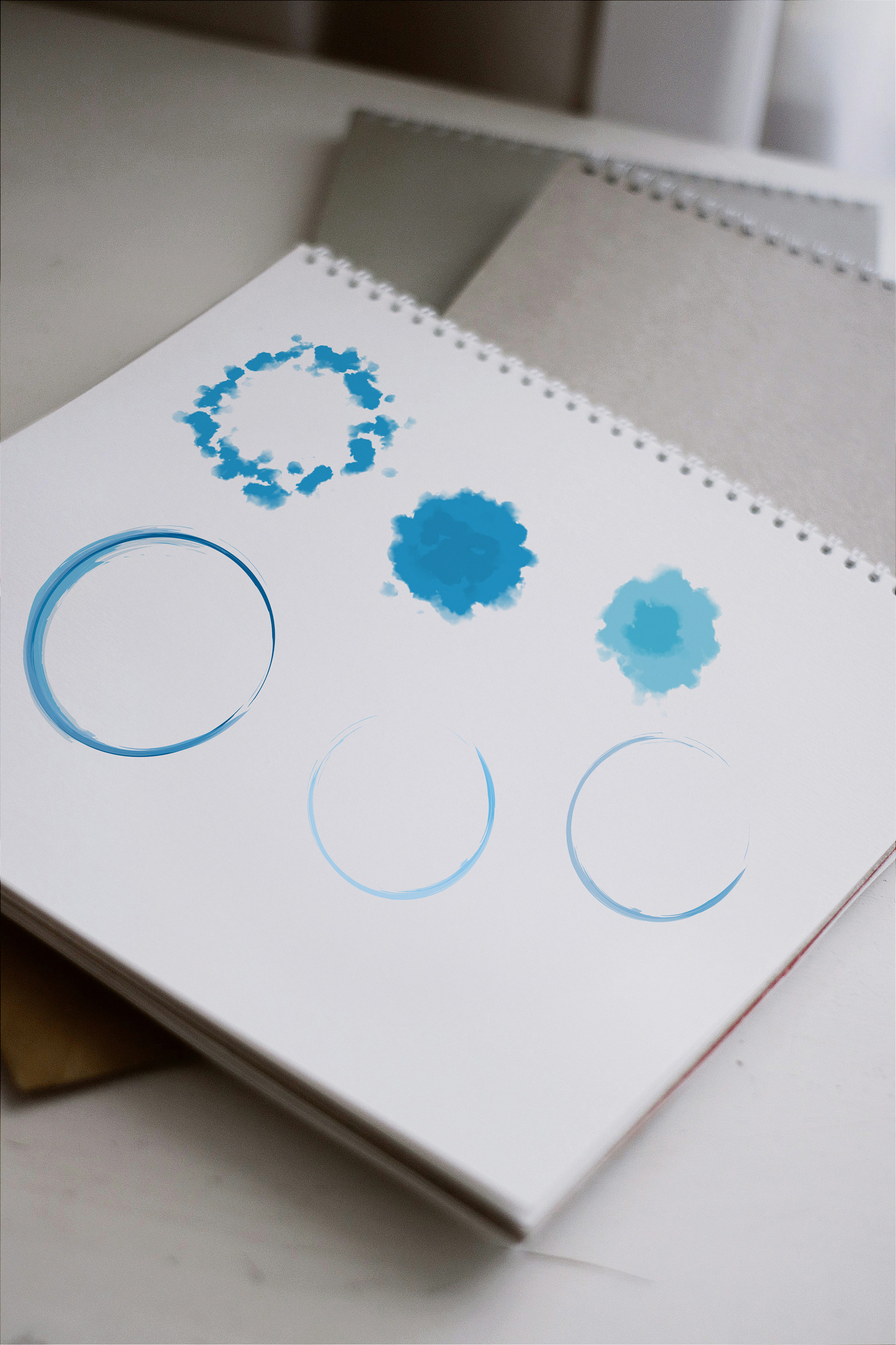
Inspired by the fluidity of watercolor, I developed a design centered around the concept of eyes - brought to life through delicate, flowing brushstrokes. The use of watercolor not only evokes the purity and clarity associated with lens care but also adds a touch of artistry and sophistication. The result is a striking new packaging that feels contemporary and visually aligned with the Bright Eyes brand.